


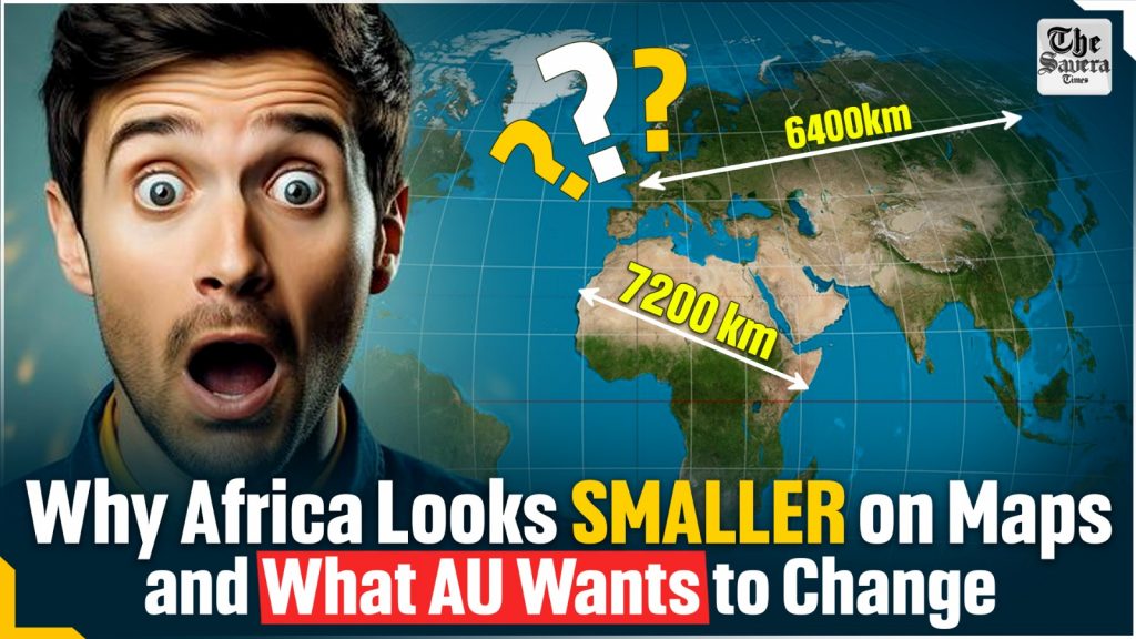
The African Union (AU) has formally endorsed the Correct the Map campaign, which calls for replacing the centuries-old Mercator map projection with alternatives such as the Equal Earth projection.
At the heart of this demand lies the charge that the Mercator projection—still widely used in schools, offices, media, and online platforms—shrinks Africa while exaggerating the size of Europe, North America, and Greenland. For the AU, moving away from Mercator is both about geographical accuracy and correcting what it calls centuries of symbolic marginalisation.
Why is the Mercator map controversial?
The Mercator projection was created in 1569 by Flemish cartographer Gerardus Mercator to solve a practical navigation problem. Sailors navigating by compass found it difficult to plot courses on flat maps because their routes—called rhumb lines—appeared curved.
Mercator’s projection stretched the north–south scale so these routes could be drawn as straight lines, making marine navigation far easier.
This convenience, however, came at a cost: landmasses closer to the poles became distorted, appearing much larger than they really are, while equatorial regions shrank. For example, Greenland (2.1 million sq. km) often looks comparable to Africa (30 million sq. km), even though Africa is about 14 times larger.
Similarly, Europe looks roughly the size of Africa even though it is only one-third as big. Canada, Russia, and northern Europe look bloated, while Africa, South America, and India appear diminished.
Over centuries, the Mercator map’s rectangular shape became the default in classrooms, atlases, and later digital platforms such as Google Maps. Critics argue that these distortions reinforced perceptions of European and North American centrality while downplaying the size and importance of Africa.
Why are all maps distorted?
There is no perfect way to flatten a spherical surface onto a rectangle. Cartographers must always compromise between preserving area, shape, distance, or direction. The Mercator projection is a conformal map—it preserves angles and local shapes, which helped sailors. But it does so by inflating regions near the poles.
Alternatives make different trade-offs. The Equal Earth projection, developed in 2018, preserves the relative size of continents, so Africa appears much larger compared to Europe or Greenland. But in this projection, continents appear curved or stretched. Another option, the Gall-Peters projection, preserves area as well, but stretches continents vertically, making them appear elongated. Meanwhile, the orthographic projection depicts Earth as it appears from space, but only shows one hemisphere at a time.
How has Mercator’s distortion shaped Africa’s image?
Scholars and policymakers have long argued that Mercator maps have contributed to Africa’s symbolic marginalisation. By making Africa appear small, they suggest the continent was less consequential, less powerful, and even less worthy of attention.
Rabah Arezki, a former World Bank economist, has described the Mercator map as a “political tool” that aided colonial domination—first by making Africa look “small and conquerable,” and now by rendering it “irrelevant.” Similarly, AU deputy chairperson Selma Malika Haddadi has said Mercator’s distortions portray Africa as “marginal.”
Campaigners such as Africa No Filter and Speak Up Africa argue that adopting fairer projections like Equal Earth is a step towards reclaiming dignity and rewriting visual narratives that have endured for centuries.
What happens next?
The AU’s endorsement is the strongest institutional backing so far for the Correct the Map campaign. The movement has also petitioned the U.N. Committee of Experts on Global Geospatial Information Management to adopt Equal Earth. Several organisations are already shifting: the World Bank has said it is phasing out Mercator, while National Geographic and NASA’s Goddard Institute have been using Equal Earth. Google Maps introduced a 3D globe option in 2018, though its mobile app still defaults to Mercator.
Yet replacing Mercator entirely will not be easy. The projection is deeply entrenched in school textbooks, classroom walls, news graphics, and even AU’s own websites. Transitioning would mean rewriting curricula, redesigning maps, and updating digital interfaces across institutions.
Still, for the AU and its supporters, the move is about more than cartographic accuracy. It represents an effort to reshape how Africa is seen—and how Africans see themselves—in global geography.